

016 tuesday may 11th
016 tuesday may 11th
the steens / accomplishments poem / tantanmen / house in quotes

tuesday’s back!
the big news from this week does not involve any further camping trips or expeditions or wildernesses or moments of self discovery. unfortunately. i did, however, get my second dose of the Pfizer vaccine and while i am cognizant of all those people around the world who have not yet had that opportunity - in large part due to the overwhelming greed and power of pharmaceutical corporations manifested as a decades-long hollowing-out of public health institutions in service of profit - i am still happy to have gotten it. and when you get yours, you should be too.
some of my friends said they cried when they got it, and said that they were told that it was a very common reaction. for me i don’t think it will really hit me until the next time i sit down on a stool in a dim bar and catch the eye of the bartender and ask for a cocktail and exchange some light but not distracting conversation and lay some cash on the bar and kind of half turn to casually look around the rest of the bar while the bartender whips up a negroni or whatever. at that point probably it will hit me. “buddy” the bartender will say “usually guys don’t start blubbering before they’ve even had their first drink!”
something like that anyway.
for those curious, i did not really have side effects from the second dose although i hear it can be a doozy. i was very tired on Friday and Saturday but otherwise was totally fine. and hey, stop me if you’ve heard this one before, but for me? the main side effect? well, it’s having my immunity raised to the novel coronavirus. one major side effect of the second dose, hell, it had to be that i’m now less likely to die from the novel coronavirus. the main side effect? not killing other people by spreading the novel coronavirus.
i think if you drink a lot of water you’ll be ok.
alright here we go.
1. painting
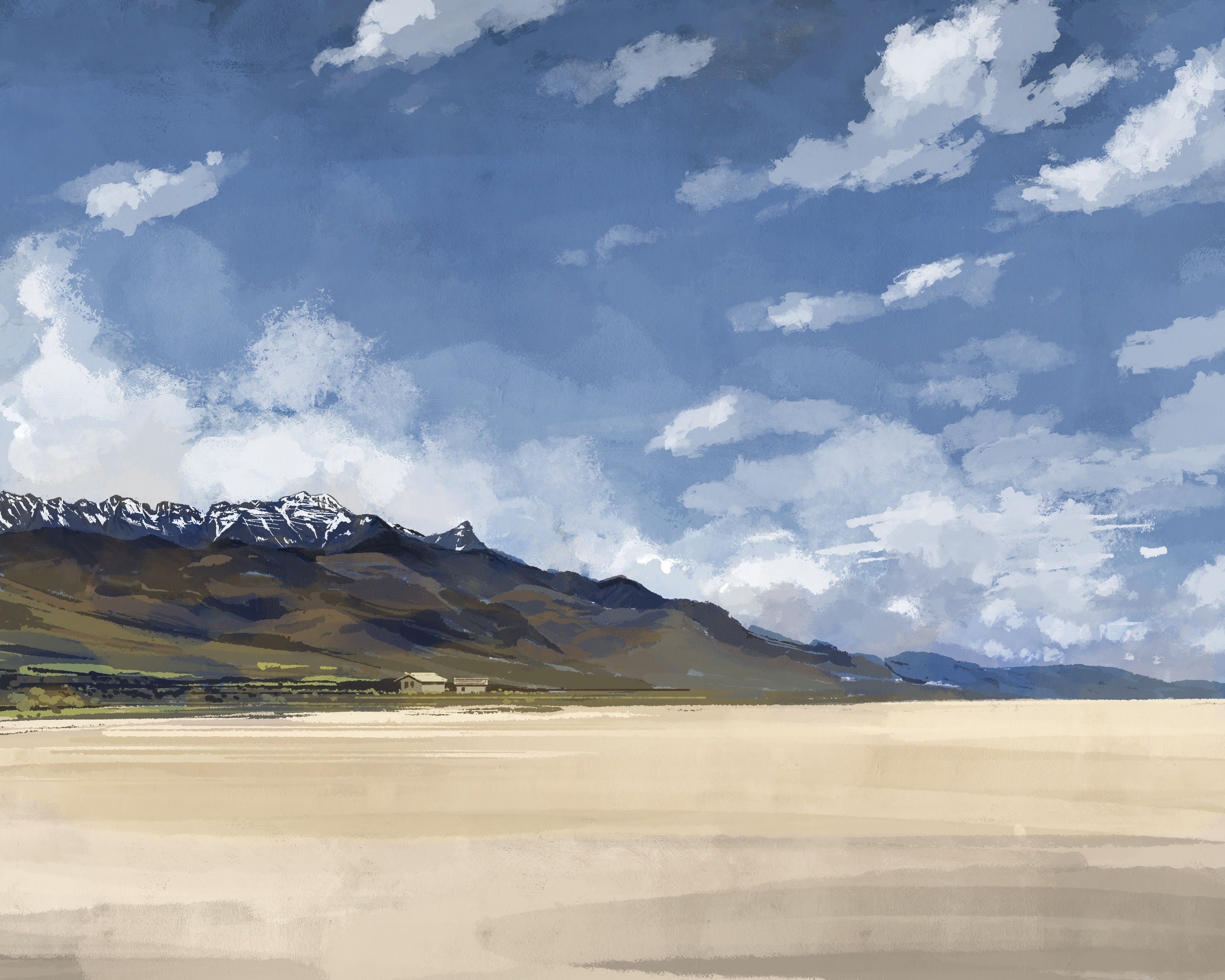
the desert again, and the steens behind it. this is from the playa of the Alvord desert, which i wrote about last week. i was going to do some plein air painting down there when i went, but when i woke up on the second day the wind immediately kicked up to the point that everything i owned began to comically tumble away across the flats. not a good vibe for painting.
i like to paint mountains but usually i do not spend a lot of time on them. actually figuring out how the various ledges and shelves of rock meet the smoother more worn down hillsides and slopes, how the snow actually sits on there, how the cloud shadows fall, and how the tones fade from purple to blue to brown to green.
so this week i spent some time on it.
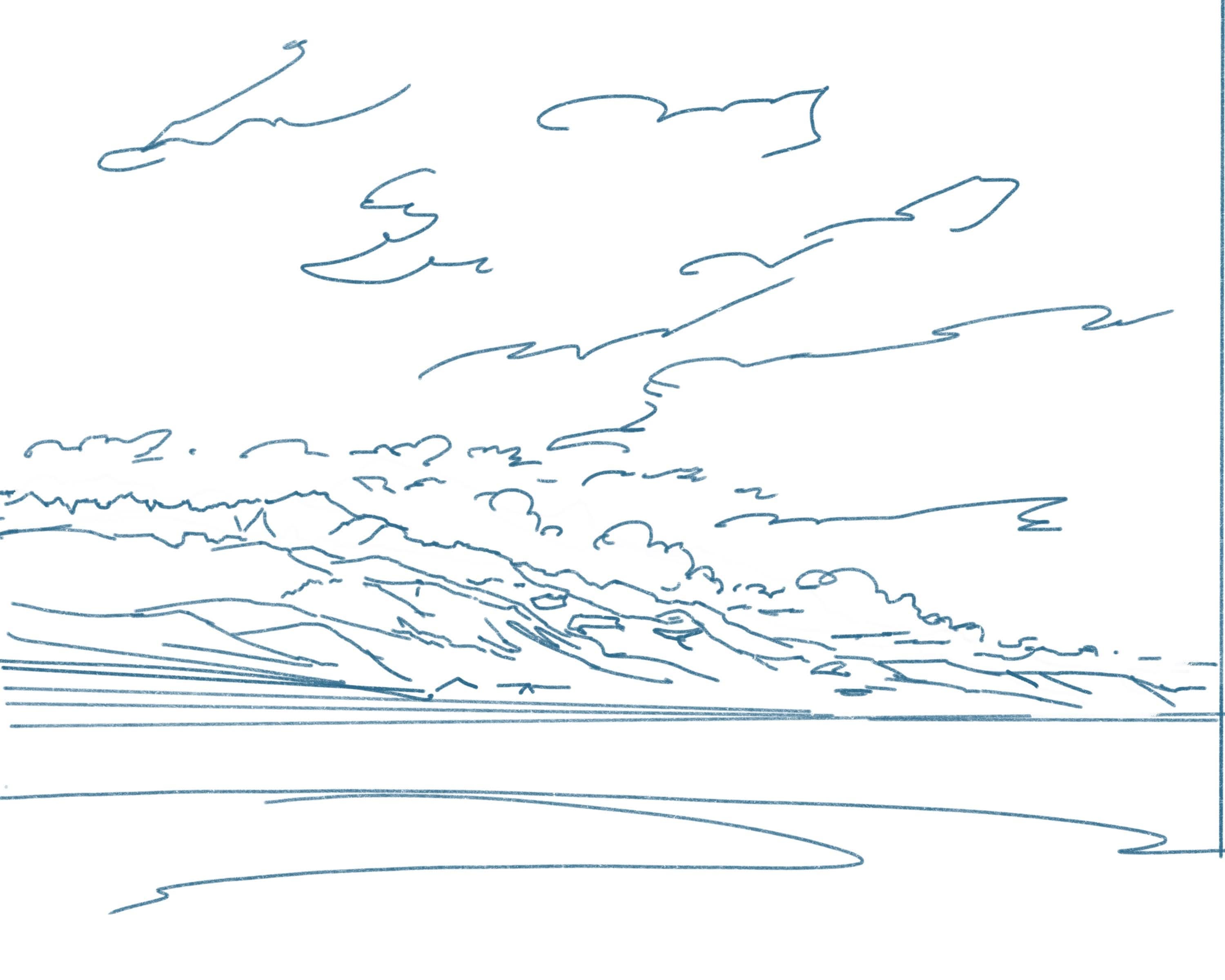
this is painted from a photo reference i took when i was out there, right from the spot i camped. compositionally i don’t think it’s very interesting and in fact you can see i think i kinda fucked up the whole horizon / edge of flats situation. the sketch shows it better - things angling more where they should be, things flat where they should be. whoops.
this isn’t exactly 100% true to life, all of it - basically what i did was looked at the photo for a long time and identified some of the major features i wanted to try and paint. the snow sitting on those far peaks. the way some of the far peaks started to fold forward and then down, and when exactly one ridge slipped behind another. and what it looks like when a smooth hillside is broken up by those bands of rock that are all over the place out there. so it’s close, but maybe simplified. or distilled.

my old nemesis. laying down the sky first so when the mountains start to go in, i can compare the hues and the tones and get them in the right ballpark better. if you’ve ever taken any kind of painting or color theory class you probably know that colors change an incredible amount based on the context you are looking at them in. so you could see a photo of greens and blues and browns and reds and if you actually zoomed way in on the pixels they would mostly all be some extremely slight variation on a shade of blue-gray. you know this already maybe.

dropping in the mountains. when i paint mountains i start with the upper ridgeline and then work down. sometimes the color will fade or desaturate or lighten as you move down, to suggest a sense of distance. if you look at that top ridgeline there that one that’s the furthest back, the tall ones on the left, you can see me trying a few different shades of blue-gray to see what actually looks right against those far clouds.

we’re pretty close to done here. except one major thing which you will notice if you scroll up: once again i have way overworked the sky, to the point where it’s not working at all.
so i scrapped it and painted a new one. the beauty of layers and digital art.
these paintings end up ultimately pretty boring, in my opinion. they feel more technical than artistic - which they are. but my hope is by doing these photo studies more often and more rigorously, i’ll be giving myself a much better foundation to start from when i actually do want to paint something more compositionally interesting.
2. poem
“accomplishments poem” - spring 2021
i know you told me not to rank these
that it defeats the purpose -
that life isn’t a series of achievements to be weighed against each other
but a broadening canvas on which the bright and dark dabs
shoulder together overlapping and
when you stand back, way back, you get a sense of it -
you were very clear about that
but just between you and me, how does
“i kissed the prettiest girl i’ve ever met”
stack up against
“i threw a bottle into a trash can from 30 feet away across the street and everyone on the street saw me sink it and stopped walking for a minute and one old guy smiled and a kid did a fist pump”
that’s a tough one right?
3. tantanmen

something i have been coming up against recently is that this platform (substack) has some kind of length limit for posts, and i don’t exactly know how it’s calculated - i assumed size, at first, but length does actually seem to factor in, but the amount of images you include is also a huge factor, so i really have no idea - but i have been having to do more of a balancing act between the sections recently. and i have a long chunk for section 4 this week so again, the food section is getting a little shortchanged.
nevertheless.
i made a couple new-to-me things this week, including this delicious dish which is pretty much exactly just based on this recipe here.
last summer before i went vegan, i spent an entire day making my own tonkotsu broth which if you eat meat i highly highly recommend. you basically keep a giant pot full of pork bones at a rolling boil for 12 hours. the rolling boil keeps all the fat emulsified that would normally separate, and you end up with that rich creamy broth you probably have had at a ramen shop.
being vegan, that creaminess has been a little hard to replicate in a satisfying way. but this comes pretty close!

mushrooms, sugar, rice vinegar, oat milk, veggie broth, scallions, soy sauce, sesame oil, corn, tofu, noodles, tahini, and some dried kelp.
you simmer the kelp in the veggie broth until it picks up a nice seaweed flavor, then you cut the heat and stir in the milk. the other stuff mixes together to form kind of a paste that you put at the bottom of your bowl, then you pour the hot veggie-kelp-oat milk broth over top and whisk it up. add noodles and toppings and blammo!
you should pay more attention to your timing than i did: some things were colder than they needed to be when it all came together. but still! very good.
4. house in quotes

i have a lot of opinions about architecture but outside of a few broad and obvious themes they are mostly the kind of thing i only notice when i’m looking at an actual building. they’re not necessarily threads that i’ve teased out and woven together into larger strands, or bubbles that have glooped together into larger, more buoyant bubbles that therefore sit closer to the surface. not usually anyhow. and sometimes not ever.
maybe it’s the same for you. i think it’s pretty common. even among people who have gone to design school. you see a building, and you think, hmm, that’s a nice building. or hmm, i don’t like this building. if you do this often enough (or if you have gone to design school) you might pause a little longer and think about what’s putting you off, or why it is you’re enjoying the building. you could turn to your friend and say “it’s a shame those windows don’t line up” or “check out how that siding turns the corner, that’s neat.”
but if you were to sit down at a desk and sharpen your pencil and open your exam booklet to the first page past the warning part and the part that tells you how to use an exam booklet to the page where it says “essay question 1: what do you like about buildings?” or maybe (to prevent cheating) it says “essay question 1: what do you dislike about buildings?”
well. that maybe is a little hard to answer without a building in front of you! hard to generalize, summarize. line it all up into a Theory.
but eventually for me, if i get annoyed by something enough, it does get to the point where i start to think gee, i have all these strands laying around. maybe i ought to weave them together into a larger, more obvious, potentially more useful strand. poke all these little bubbles into a big buoyant bubble.
and if you’ve lost track of the metaphor at this point i will be a little more specific: i recently noticed myself rolling my eyes at a specific architecture move, and noticed that i had been doing it and seeing it over and over (the eye roll and the move, respectively), and had sort of a half idea of why i was getting annoyed but hadn’t really fully poked at it, and so i here i am sitting down at my desk spinning it into some kind of throughline.
the move is this: the zero eave house. also known as the monopoly house. also known as the “archetypal house shape” or a “contemporary expression of an ancient residential form” or etc. etc.
here’s a local example:

and the reason it annoys me, i believe, now, primarily, though yes there are a couple other minor sub factors but mostly: when you design a house this way, you are putting it in quotation marks. you have a little smirk on your face. you’re looking around a little bit, trying to catch the eye of another former design school attendee who maxed out their credit cards to dress better than their client. and for one reason or another, at this point in my life, i have just about lost my patience with that particular brand of smirk.
here’s another example:

if you pay attention to buildings or architecture at all, even just on a local scale, like in your city, or in your neighborhood, or vaguely on twitter, i’m sure that you’ve noticed the prevalence of this move in the past, oh, 10 years or so. it’s kind of in the same cohort as the resurgence of screens created by vertical wood strips, maybe a little younger than that, and it’s been getting popular for maybe a little longer than shou sugi ban siding or imitation shou sugi ban siding but it is definitely in that group as well. if all three of those Moves were talking to each other at a party, in other words, you would get it. visually it would make sense to see them together, kind of off to one side or maybe out on the porch, looking back across the rest of the party every so often in a way that made it extremely clear that they were talking shit about every other person in attendance.
generally speaking, buildings with pitched roofs have eaves for very good practical reasons. in wet climates, eaves shed water from the roof away from the siding, which makes your siding last longer and keeps your house dry. in wet and cold climates, eaves keep the bulk of snow away from the immediate vicinity of your walls (i.e. where you might want to, say, open a door) and also provide a place for water to re-freeze that is not directly above your wall. this is not to say that all houses historically have had eaves - plenty of what we might call “traditional” building styles didn’t use eaves. mostly when there wasn’t a pitched roof involved, of course. but in areas with a lot of wind, the disadvantage of an eave can outweigh the upside. and if you’re not building with wood, sometimes it’s not practical or possible to build eaves at all.
but: if you are building a house in an area with rain, and you are going to put a pitched roof on that house, i don’t think it’s too outlandish to suggest that unless you have a very good reason, you should plan to put eaves on your house.
and when we see these monopoly houses, they stand out. increasingly less so, as the Move becomes more and more common. but for some reason, they have decided to go with the pitched roof while also forgoing the eaves. and so you think: well maybe they have a good reason!
they do not.
in some ways, this is a signifier of wealth: i can afford to maintain and repair my siding that is going to age and weather at a faster rate because it’s more exposed to the elements. i can afford to manage the inevitable problems 20 years down the line when my internal rain drains start leaking and the literal walls of my house fill with water.
in some ways, this is just to stand out: my “House” does not look like your house. it’s sleeker, slicker. the edges are sharper. it looks like it was extruded, or wrapped, or peeled.
but mostly i think it’s because someone needed or wanted a house, but they didn’t want to be thought of as the type of person who lives in a regular house, and they (or the designer they hired who maxed out their credit cards to dress better than them) got a little smirk on their face like, listen, OK. it will be a house in some ways. but check this out: what if it was a “house.” in many ways, this will be a pretty conventional arrangement of spaces, a home in which you will be popping popcorn and watching Netflix and complaining about your job and rolling your eyes at the dishes in the sink. but check this out: we’re gonna do it without eaves. now what do you think of that? pretty slick huh. a rectangle with a triangle on top. it’s a house, for sure, in some ways, the boring ways, but more importantly, it’s, you know, a “house.”
and putting it in quotes will spare you of some indignity.
somehow, in the age where nobody has any money, you have acquired enough money to hire a designer to design you a “house.” and to hire a builder to build your “house” and to pay the builder a little extra to quit shaking their head at the waterproofing details your designer insists will work fine. and since you are the type of person who is building your own home in the first place, rather than buying a pre-owned model -- or, like most of us, renting an apartment -- you need that layer of detachment. you need a signifier, a smirk, a shrug, something to set yourself at a slightly ironic distance.
the fact that it essentially amounts to an unfunny one-line joke is reason enough. and the fact that the joke has already been made a million times by now, well. that’s okay too. it’s funny, but if it’s not funny, at least it’s modernist. probably it’s both modernist and funny, actually. it’s something for sure. it’s worth it. you can convince yourself it’s worth it.
you need a house, but you need to put it in quotes.
here are some of the threads that did not make it into the above yarn. they factor in somehow. maybe i’ll write more about them in the future. but for now, here they are to think about:
what kind of firm designs these houses, and what do they have in common
what kind of people live in these houses, and what do they have in common
this trend is all over apartment buildings now too, and the implications of choosing that roof form for multi-family buildings is different in some ways, but more similar than you might think
well what’s wrong with people doing this, anyway. what’s your deal, man. it’s fun, it’s different. quit being a grinch.